At Cross Purposes, 56 Group Wales

I currently have 4 paintings in a touring exhibition of 32 artists, At Cross Purposes, a project instigated by 56groupwales
The exhibitions are accompanied by a publication with an introduction by Bedwyr Williams and a series of three-way conversations between two artists and a curator, Frances Woodley. I spent over a year corresponding with Frances and Welsh metal sculptor, Robert Harding, discussing our approaches to work including how the idea of ‘viscosity’ applies to his casting and my painting.
This exhibition opened at Oriel Môn museum and art gallery in Liangefni, Anglesey and travels to Queen Street Studios Gallery, Belfast, 7th – 28th September 2023; and Elysium Gallery Swansea, November 7th – December 23rd.
‘Always Counting, Never Adding Up’

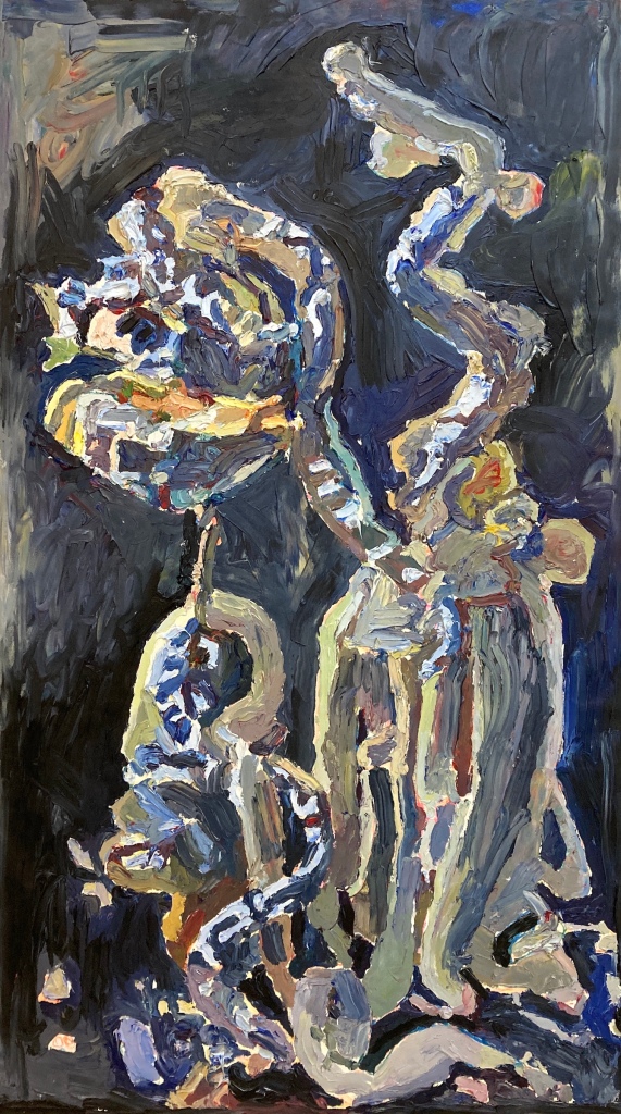
‘Isosceles 2’

Always Counting, Never Adding Up


Always Counting, Never Adding Up is an exhibition of new paintings by Edinburgh based artist, Tim Dodds.
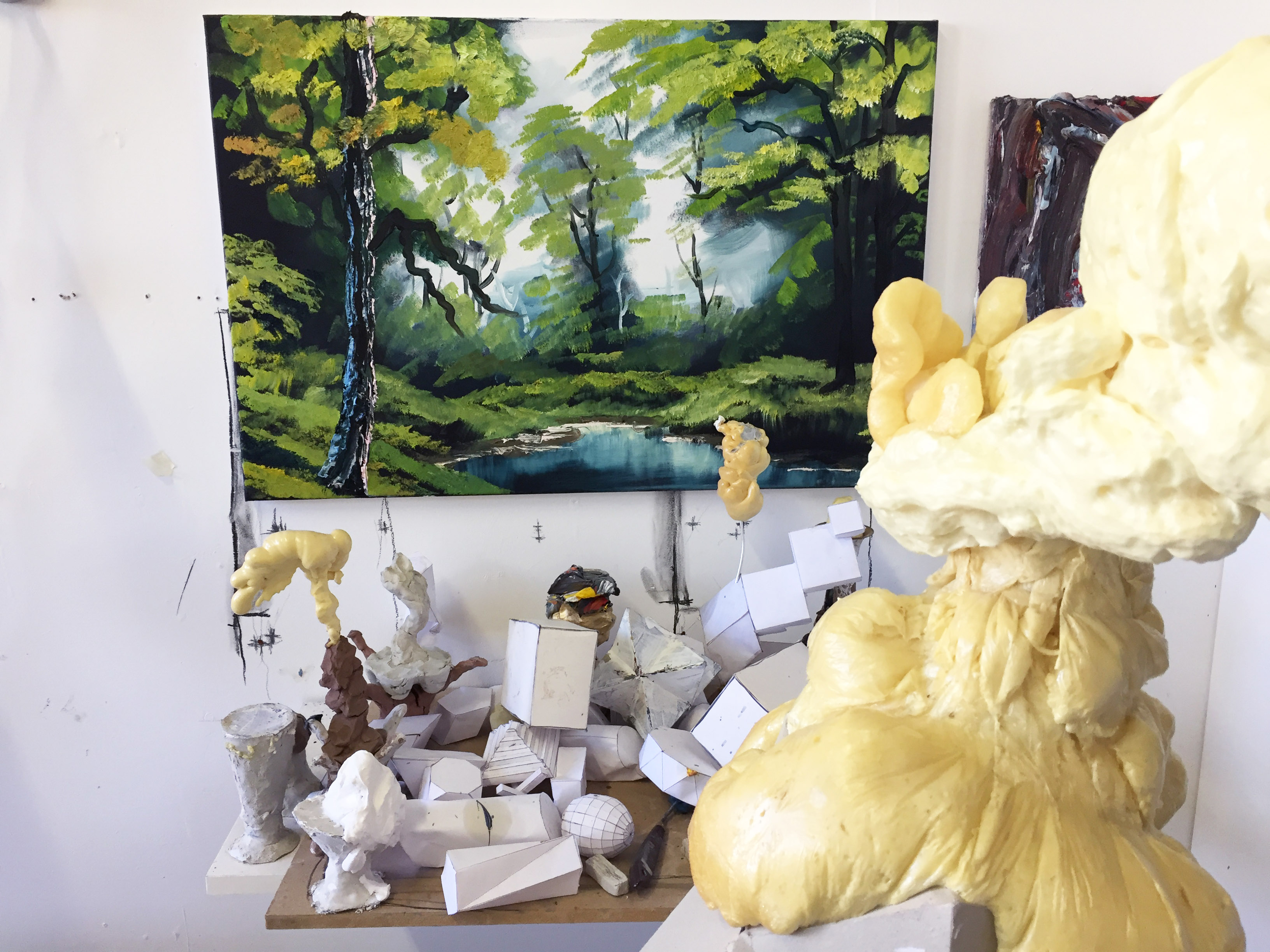
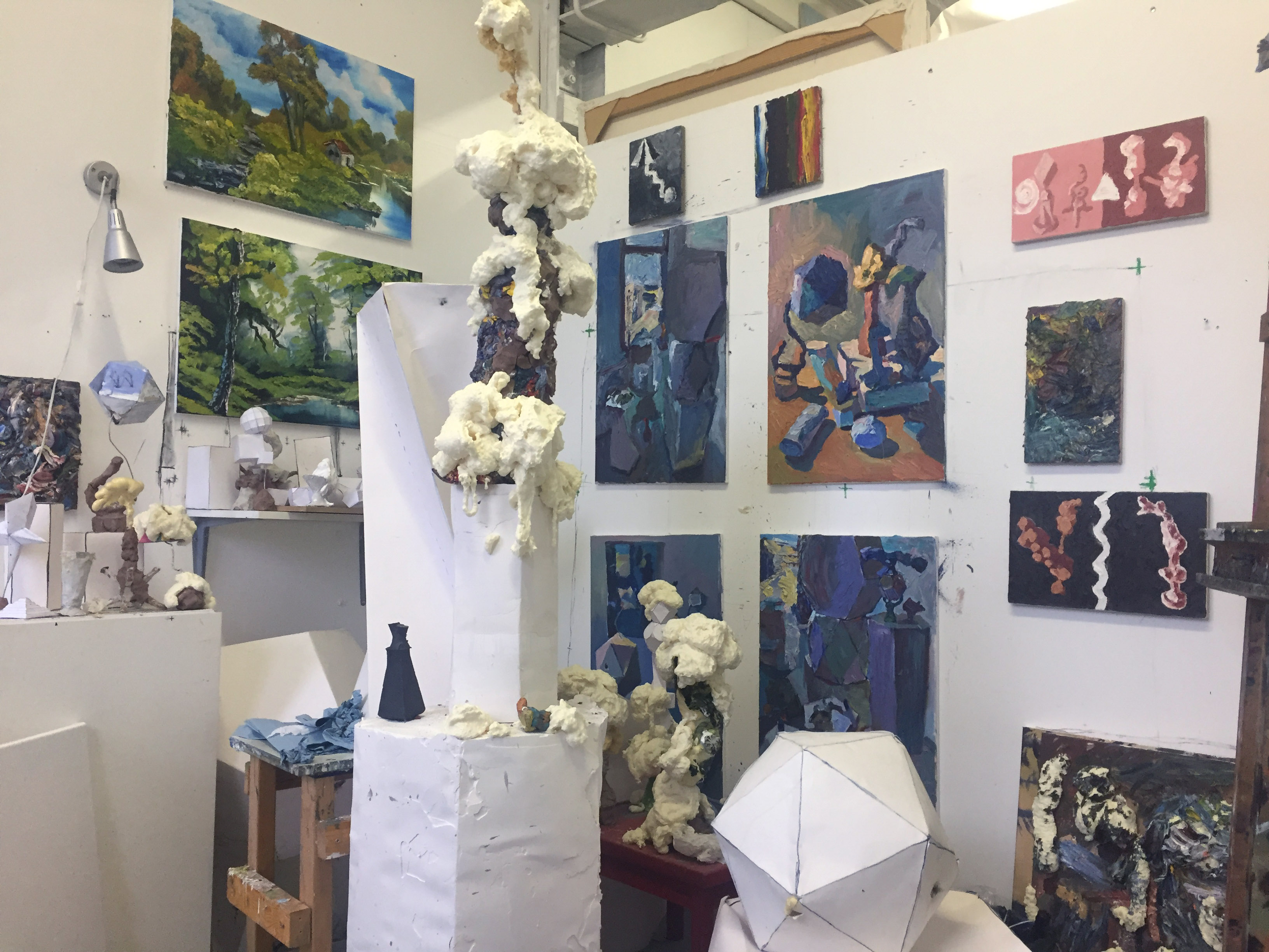
Tim Dodds constructs makeshift models out of different things such as card, clay, foam, found items, and painting materials, including discarded canvases and surplus oil paint scraped from his palette.
In his work he explores ideas of connection, inner and outer, as he tries to find his way into the essence and act of painting. His distinctive approach uses the medium as a language, as if it were to become an unpredictable structure for thinking and world-making. Humour, playfulness, and lightness are essential elements in the work: absurd and far fetched motifs create juxtapositions that spark curiosity while textures and techniques shift impression depending on the distance they are being looked at from.
Cycles and transformations occur across Dodds’ practice: the recursion where paintings reimagine the constructed models from which they are painted; the ways in which materials and models are recycled and repurposed in the creation of new paintings. It places painting in the middle of things, without an end point. It is this lack of resolution that the art historian and critic, James Elkins, in his book, ‘What Painting Is’, defines as a necessary condition for painting. He describes the act of painting as ‘liquid thought’, and the painted surface as something from which it is impossible to extract isolated ideas and fixed meanings. According to Elkins, paint is so compelling because it is ‘always counting but never adding up, always speaking but never saying anything rational, always playing at being abstract but never leaving the clotted body.’
Dodds carefully arranges the materials and paints them from direct observation. The models find new life when they become subjects of his painting: they overlap, cast shadows and, in some cases, balance precariously, creating a composition of dynamic shapes and rhythms. Understanding the whole scene is subjective: it does not matter where you start from, anyone can consider, find and make up their own meanings about the paintings in a way which reflects on their inner status at that moment. Each viewer will have their own unique experience with the work, as they explore the layers of meaning and emotion woven into each piece.
This work commences a 2-year project, funded by Creative Scotland, to develop my painting practice and exhibit. Always Counting, Never Adding Up sits alongside other exhibitions taking place this year including: ‘At Cross Purposes’, Oriel Môn, Wales and ‘Paintings: New work by Thomas Aitchison and Tim Dodds’ at Mote 102, Edinburgh and I am showing work in upcoming exhibitions in 2023 at QSS Studios Gallery, Belfast and Elysium, Swansea.
Tim Dodds is an Edinburgh based artist. He studied at the Slade School of Fine Art (1998-2002) and Edinburgh College of Art (2012-14). He has exhibited in solo exhibitions at GENERATORprojects, Dundee and 36 Limestreet, Newcastle and group exhibitions including at the Annual Exhibition, Royal Scottish Academy; The Fleming Collection, London; Spot Korin, Kyoto; and Rhubaba, Edinburgh. His work belongs in the Royal Scottish Academy collection and has been written about in several publications, including Apollo Magazine; ‘Models and Materialities’ and ‘At Cross Purposes’, published by Aberystwyth University School of Art. He has received many awards including, most recently, funding from Creative Scotland’s Open Fund to develop and exhibit work over the next 2 years.
Paintings: New work by Thomas Aitchison and Tim Dodds

Ten years on, this upcoming show revisits the creation of the ‘TinTimTamMan’, a project the two artists developed in 2013, depicting a person covered in tin foil in a series of photographs. In this image, ‘TinTimTamMan’ appears suspended, sideways in his own tin foil world, a mirror-coated Narcissus reflected in a pool of water. The way the foil reflects, disrupts and abstracts reality encapsulates approaches to painting in this exhibition.
Both artists develop imagery by reflecting on and reinterpreting their own art processes, gestures, forms, materials, textures, model making. For Thomas Aitchison, this involves building up paintings in layers, each layer responding, building on and transforming the finished work. Tim Dodds constructs makeshift models out of basic materials such as clay and card, reinventing them by bringing them together into still life and then carefully painting these collective groupings.
A new text by Jake Watts is published in the mote booklet: ‘Since our paths last crossed, The TinTimTamMan has spent a decade cast in foil traversing the cosmic topology of time.’


‘Blue Circle’

Plastic Cups

Star

Clay Forms (2)


I’m thrilled have ‘Royals’ included in the 195th Annual Exhibition at the Royal Scottish Academy (…. so perhaps it’s sort of got the Royal seal of approval?).
Info in the overview:
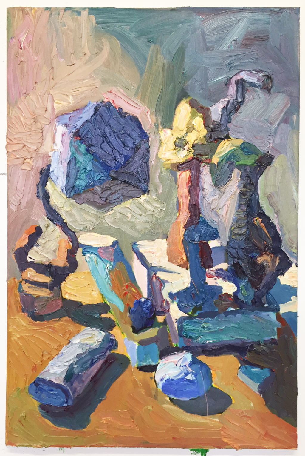
I make paintings from direct observation of makeshift models that I construct out of a wide range of materials. These models are unnameable and abstract in form – though perhaps suggestive of geometric, organic or biomorphic forms.
‘Royals’ was painted over a few months in 2020. The 2 models from which it was painted measured around 2-3 feet high and were a wild amalgamation of materials including foam, clay, paint and even an old canvas smeared with oil paint. The painting depicts the surface details, textures and the passage of light across the forms. As I finished, the two forms on the large painting struck me as humanlike, displaying a debased pomp and splendour that gave them a something of an absurd regal air.
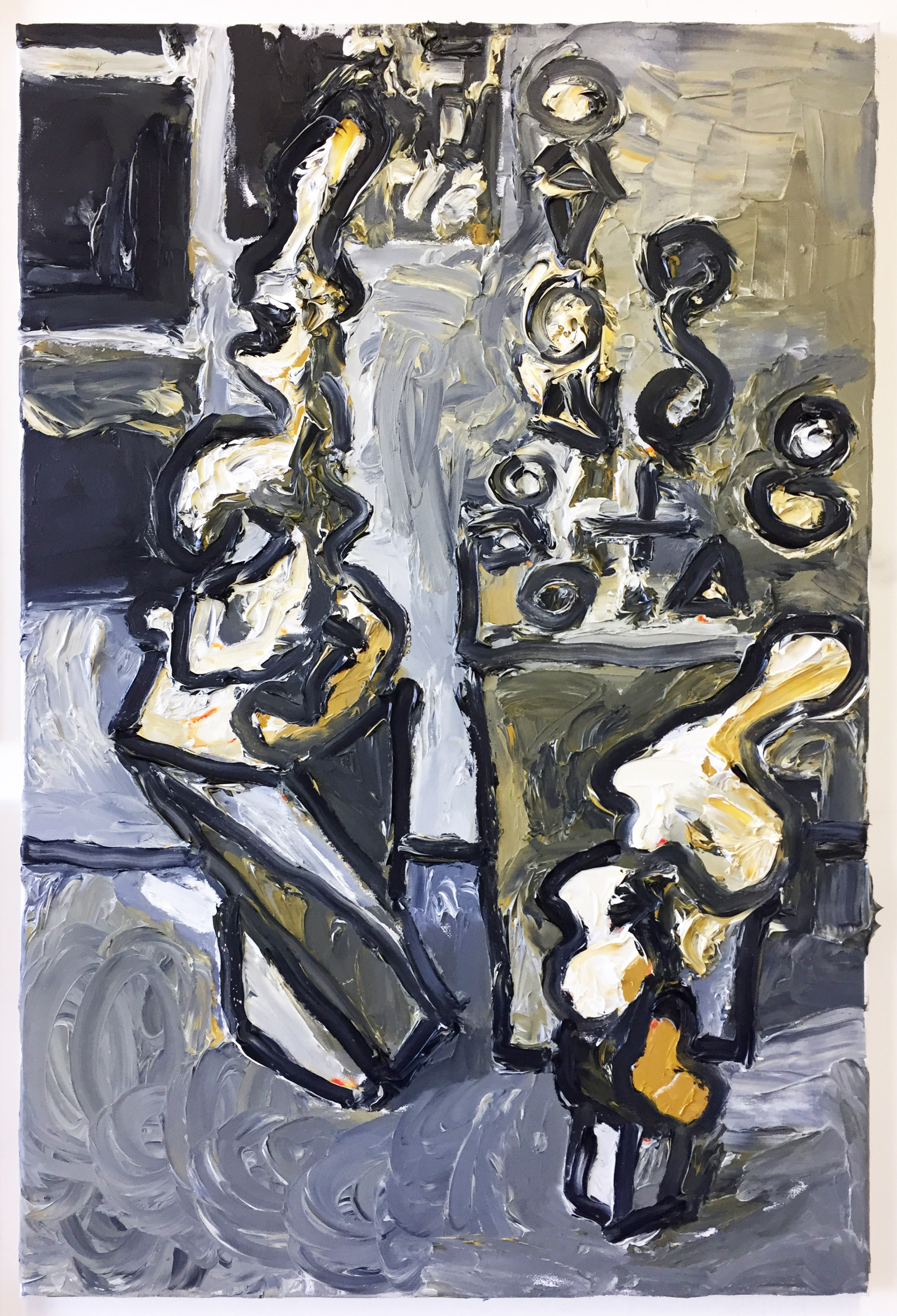
Clay Forms

This painting features sculptural models made out of grey and terracotta clay. Some of these models are new whilst others have been recast, and in some cases adapted, from previous pictures. The set up was painted from direct observation in natural light. It was painted over a ground of bright green oil paint.

THING WORLDS is an exhibition of small paintings by contemporary British painters.
The selection of paintings has been made by Frances Woodley.
The painters represented here are delighted and excited to be exhibiting in Art Spot Korin gallery and would like to extend their thanks and appreciation to Masahiro Kawanaka, the gallery’s curator,for this opportunity. All the paintings in the exhibition depict a thing, or several things, in an invented or imagined world. Sometimes it is enough for a painter to suggest a world through a shadow or a field of colour, at other times a more detailed setting is required. The familiar objects and imagined things in these paintings are sourced from buildings, models, trinkets, digital objects, literature or even paint itself. It is the implied scale of these paintings that sets them apart from traditional European still life painting(where familiar objects are placed life-size on a tabletop or shelf). The paintings in this exhibition may be small in size but they often suggest huge or ambiguous size and distance. The painters are interested in making the familiar extraordinary and bringing unexplainable things to life through painting. Things are created here that do not exist in the world except in their paintings.
Dr Frances Woodley

Essay by Dr. Frances Woodley, author and curator
https://www.contemporarybritishpainting.com/plausible-objects-difficult-things/
https://www.contemporarybritishpainting.com/tim-dodds-plausible-objects/
Royals

The 5th

Mutant Disco


Correspondence
Tim Dodds – artist based in Edinburgh who constructs makeshift models which become the subject matter of paintings.
Alex Hanna – artist based in East London whose recent paintings depict arrangements of disposable packaging and objects of little or no material value.
Frances Woodley – Artist, Writer based in Cardiff who has recently undertaken a series of curatorial projects investigating contemporary still life including All Coherence Gone? Historical Currents in Contemporary Still Life; Still Life: Ambiguous Practices; Models and Materialities: Confabulation and the Contemporary Still life
An excerpt from an ongoing correspondence:
FW:
You both talk about moving between the constraints of observational work and more spontaneous work, and always this way round. I’m concluding from this that the observational work produces crucial understanding and fluency required for the more looser intuitive work – ‘for grounding ideas’ and ‘cutting them down to size’ as you say. It’s also, surely, one way of identifying the limits, possibilities and particularities of your own looking and interpretive skills – making them ‘mind expanding’ and productive.
I am also fascinated by the idea of you both producing paintings for personal use – as liberators and catalysts for subsequent work, made without intention to exhibit or sell – though you might decide to do so later. Isn’t this the same mentality that you would apply to drawing, but being closer to the operations, materiality and object qualities of a painting, it takes the form of dress rehearsal or workout. Don’t you dread something amazing happening in these private paintings that then turns out to be unreproducible (this word first used in 1845 apparently – was it also accompanied by angst I wonder)? I also like your suggestion of experimenting with bringing the 3D model into its painted representation – challenging and exciting, and an obvious throwback to Cubist collage/assemblage.
I became interested in non-objects in painting a while back as you know – objects that existed physically as nameless entities but which were nonetheless able to be described in paint (Johnny Green) as well as objects that were generated by the process of painting alone (Clare Chapman, Louise Brierley, Ivan Seal ). You mentioned accidental qualities in a medium that spontaneously creates a sort of object. Yes, I like your idea of using scraped off paint but also suggest remnants from other processes such as cutting and tearing. Strange to say, being so involved with the work of others over the past five years has made it more problematic, not easier, for me to generate non-objects for myself though I have been experimenting with Indian inks, keeping notes of each ‘accident’ and each reaction (depends on acidic or alkaline nature of the ink and solvent), with a view to introducing them into larger works. There is some potential here but they may need to be photographed and enlarged on the computer.
What you say about constructing the larger models out of paper and glue makes sense; it makes them fallible at that scale. This ‘inadequacy’ in the paper construction then introduces risk and injects unpredictability into the model and exhibition space alike and prepares artist and viewer for a more engaging experience. I suppose that Alex’s ‘foray into thick and spontaneous application of cheaper quality oil paints’ is doing much the same thing – putting his practice at risk. Taking these risks gives your painted objects and models agency – i.e. instead of merely a geometric solid, they take on qualities of a subject. You write: ‘they function as non-subjects which simply generate colours and tones to paint from’ but, for me, they seem to be doing much more than that particularly when light is made to fall on them. The painting I have of yours here has a green tetrahedron with three legs and an extraordinary shadow that together bring the solid to life. The painting as a whole is able to draw on its models while going beyond them to create an agency of itself – a ‘make or break moment ….” as you write.
Moving on from issues that cropped up in my PhD I’ve thought a lot about your conversation with Alex about paint as object, a painting as an object, and painting a painting as a represented object. I’m not clear from Alex whether he has used a photograph of a painting as the object/subject of a new painting or, more simply, used photographs of his model setups. I will have to ask. Painting from drawings rather than the objects themselves also serves to screen out ‘noise’ in a similar way I presume. I wonder whether working from photographs gives Alex access to a sense of calm that the dynamics of changing light conditions on objects could not provide. Though there are clearly common interests between you, the contrast between stillness and dynamism does distinguish your approaches from one another – even when Alex is using impasto I would say. Another difference between you is this hint of absurdity and suggestion of kitsch and the abject in your work whereas Alex gives the banal and throwaway a transcendent quality. The painting I have here of his is a simple transparent box (supermarket packaging) entitled ‘Incubator’). It is understandable as both simultaneously.
TD:
I like how you (Frances) describe a kind of painting which is done with the mentality of drawing. This is an unusual angle – it seems almost anything can be considered drawing except painting. The idea of ‘painted drawings’ makes a lot of sense in terms of the quick paintings I’m doing on cheap pre-stretched which are, as Alex suggested, like a sketch pad. Like drawings, they’re not self contained artworks, but seeking out and developing the subject matter. The angst you suggest, isn’t to do with concerns about something being unreproducible, but more to do with the impulse I have to test everything out through painting. Making quick paintings, especially at the moment, feels necessary – the symbiotic process, whereby the paintings inform the models and vice versa, is speeded up.
Because I use a lot of paint, especially in recent work, I need to buy cheaper oil paints in bulk and I’ve also been donated bags of old, unused oil paints which I use. The labels of some of these old paints have fallen off so the paint itself has an unknown element, a bit like the objects I paint.
As well as scraping off the unused oil paint from the palette at the end of a session and incorporating this into models, I’ve also being using it to rework ‘failed’ paintings into somewhat muddy, abstract paintings. Another kind of provisional painting I’ve been doing, not necessarily made to exhibit, are created from working along to Bob Ross demonstrations on YouTube. Initially I did these paintings because I wanted to investigate how my still life paintings look alongside somewhat kitsch landscapes of snowy mountains, waterfalls, a cabin by a lake etc. Something else appeals to me in doing these: in following Bob’s instructions, there’s also a connection to the step by step procedures I’m exploring, for example, in constructing the geometric models from templates and even drawing my still life compositions in a methodical way using the viewing frame. I’ve attached a couple of studio shots.
In some sense, I suppose these aspects, such as painting very directly, often just with my fingers; recycling and using cheap materials; and painting along to Bob Ross, are strategies to question snobbish, refined attitudes towards painting which are deeply instilled.
Alex, it’s useful to know about your the limited palette. With all these donated paints, I’m experimenting with different palettes and may try this one. It’s funny how, as you say, perhaps out of caution, we stick to tutors’ suggestions regarding palettes and colours from our student days. I’ve only recently started using yellow ochre again after a tutor on my foundation year, 21 years ago, warned that this was an inferior pigment to be avoided. What you say about viridian and alizarin is interesting – I’d not thought about them as overpowering. I’m influenced by my time in the Slade life room where tutors encouraged us to use bold colours such as these and other strong, synthetic pigments (e.g. winsor green, blue, purple) as well as bright cadmiums. Regarding your enquiry, I haven’t noticed any cracking – did you mean from the Spencer white? BTW, I’d recommend Cass Art’s titanium white which, if you buy it during one of their regular sales, is as cheap as other cheap brands but definitely better quality. I’ve not tried their other colours yet.
Frances, I was interested in what you say about your own experiments with generating non-objects being problematic and what you mean by that? Is the the need to photograph and enlarge them on the computer a way of distancing yourself? For me, looking at my subjects through the viewfinder is a necessary way of separating myself from them, like seeing them through a window. Also, I find when I’ve set a model aside, it gathers dust, begins to disintegrate, clay cracks, expanded foam yellows. They can feel more usable when they’ve become their own thing through ageing. I’m interested in your scientific approach of keeping notes of your experiments so that they can be re-performed. Do you examine how your experiments age? It brings to mind GL Brierley’s work and her mastery of experimentations with paint and how she exploits effects such as crinkling and sagging.
AH:
I’m interested in the yellow ochre situation. When I started using it as part of this palette I became aware of its considerable possibilities. Earth colours are to some extent seen as dull and lacking in power. However many have great versatility and intensity, I’m sure you’re aware of this but it’s worth mentioning. Yellow ochre is in my opinion a combination of both and imbued with considerable strength. Some other earth colours don’t need to be mixed with other colours and can be used directly from the tube. I must confess to feeling a little unsure about this and always feel the need to alter or stick my ore in and modify in even a slight way.
There is a palette which uses Yellow Ochre (warm), Mars or similar (cold) black and a white. When the black is mixed with white it becomes a blue. It’s very reductive. You may have used it at college.
I did a life painting course at the Slade some years ago and the first thing I noticed was the inclusion of a very strong blue fabric against the nude. Strong colour seemed to be embraced and a thing of beauty. During this course I did make a concession, I included cadmium yellow. However I still believe that yellow ochre can cover most of ones yellow requirements.
Incidentally I am just recently getting to grips with the new Spencer paints. The white (to some extent the keystone of my practice) is not as thick as previously, this is something I will have to think about and come to terms with. It’s seems a bit more homogenised, but I may be wrong. I wish they offered a warmer blue. The current one is a green blue and I immediately became suspicious. Could it be harbouring a dangerous tyrant, yes viridian! Please excuse my obsession, it’s just a personal thing.
I understand your desire to question your process through a step by step method. I have never watched Bob but have heard about him. My first steps in oil paint as a boy involved following the teachings of ‘Nancy Kominsky’. This broadly speaking involved, bowls of fruit, flowers or Central Park in the Fall. The canvas was stained with a burnt umber and white spirit mix applied with a rag. A grid was then painted over this ground and then bit by bit the painting was constructed using quite an extensive palette. The program was called ‘Paint along with Nancy’ and it was always on in the afternoon whilst I was at home on lunch break. I tried to mimic her technique with varying results.
FW:
I am absolutely fascinated by the way you both talk about paint and painting – like alchemists. It’s such a treat! But it’s a foreign world to me. When I use colour I am almost a complete autodidact. (The problem of having done a graphics oriented foundation course, a ceramics degree and an MA in etching.) Re viridian – Alex, do you know Alfred Janes’ paintings? A viridian junkie if there was one.
Early influences are interesting too – I barely saw a television when I was growing up, but I got to see the Dutch museums every summer of my adolescence. So I pretty much missed out on these ‘how to do’ programmes. Tim, will you be looking to develop these landscapes on your few free days? Are they destined to be used in conjunction with your models in interesting combinations of scale or are they only explorations in method.
I keep gravitating to the computer because I have discovered that I enjoy painting this way. I am attaching a sample of an image I’m working on – a cheap shell flower – one of several that I eventually intend to ‘collage’ into a composition where they will be ‘finished off’ in some way. (it is unlikely to be used at more than about 12 cm across.) This method will be somewhat similar to the way in which traditional still life painters would assemble motifs drawn from other artists’ paintings, sample books and engravings. However in this case all the motifs will all be my own. Early Flemish still life (before the use of 2 point perspective – seemingly out of choice) often employs a generalised light source to cohere the picture while the components of the image are treated by painter and viewer alike as discrete images of delight. This makes them look a bit wonky sometimes but I like that. Also I like using kitsch or low status objects and materials so that I can enhance them through representation. I’m not showing you how these components will be used – I have plans – but they’re not for divulging just yet! This is due to uncertainty rather than secrecy.